


Let’s start with a situation you’ve probably seen before.
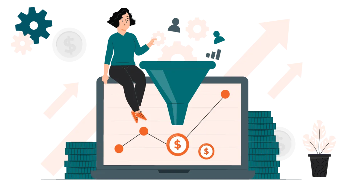
Your website is getting traffic. People are visiting key pages. Reports show steady activity. Yet conversions feel unpredictable or flat. Someone asks the obvious question: do we need more traffic?
Well, I’ll leave the answer up to YOU once you read the full text.
The real issue is not how many people arrive on your website; it’s what happens after they do.
B2B buyers don’t behave like impulse shoppers. They arrive with questions, not intent to buy. They skim, leave, return later, and often share the site internally before any decision is made. Sometimes weeks pass between the first visit and meaningful action. But many websites are built as if every visitor is ready to convert right now.
That mismatch creates friction.
Pages are designed independently, rather than as part of a connected experience. Messaging assumes clarity when the visitor is still exploring. Calls to action often prompt users to complete demos or fill out contact forms before trust is established. From the buyer’s perspective, the website feels rushed or unhelpful. So they leave, quietly.
This is why traffic alone rarely fixes conversion problems in B2B or even other niches. When a website doesn’t align with how buyers think, evaluate, and decide, even high-intent visitors struggle to move forward.
So, before thinking about redesigns or optimization tools, there’s a more important question to ask. Does your website support the way your buyers actually move toward a decision, or does it expect them to do all the work themselves?
That question is where everything starts.
Why B2B Websites Struggle to Convert Even With Traffic
Key takeaways upfront:
- Traffic does not equal progress in B2B.
- Buying decisions take time and involve multiple stakeholders.
- UX and UI decisions directly influence whether users move forward or drop off.
- Many websites perform differently on mobile and desktop, creating inconsistent experiences.
- Navigation is frequently designed without clear structure, forcing users to guess where to go next.
- Most websites are built page by page, not journey by journey.
- Conversion issues are usually journey misalignment issues.
Even with the right audience arriving on your site, conversions can lag when users struggle to find what they need. Let’s talk about a number, the research shows that 53% of mobile users abandon a site if it takes longer than three seconds to load, highlighting how quickly poor experience disrupts intent. Navigation clarity and well-structured buttons guide attention, while inconsistent mobile and desktop experiences break focus. When users can’t quickly assess value or next steps, interest stalls before it turns into action.
What Customer Journey Mapping Means in a B2B Context
At its simplest, customer journey mapping is about answering one question:
what is someone trying to figure out when they come to your website, and what should help them next?
So, customer journey mapping is not about listing pages or tracking clicks. It’s about understanding intent over time. It looks at how people move from uncertainty to clarity, step by step, across multiple visits, devices, and conversations. Instead of asking where users go, it asks why they are there and what would make the next step easier.
Customer Journey Mapping Focuses on Intent, Not Click Paths
Most journey maps fail because they describe movement, not motivation. Homepage to product page to contact form looks neat on paper, but it says nothing about what the visitor was actually trying to understand.
On an early visit, people are usually orienting themselves. They want context. First, on a return visit, they’re looking for proof or comparisons. Later, the focus shifts again toward risk and credibility. The pages may be the same, but you see the intent is not.
Customer journey mapping works when it captures these shifts. That’s why intent sequencing matters more than page sequencing. When a website treats every visit the same way, it forces people to interpret relevance on their own. Many won’t.
This difference becomes especially clear when you compare consumer and business journeys.
How B2B and B2C Customer Journeys Actually Differ
Consumer journeys often unfold in a short window. One person compares a few options, weighs price or convenience, and makes a decision without much back and forth. In those situations, the website has a clear role. It needs to surface the right information quickly, remove friction, and make it easy for that individual to move forward.
As decisions take longer and rarely belong to one person. People return to the site multiple times, sometimes after internal conversations, sometimes to answer new questions that didn’t exist on the first visit. Each visit carries a different purpose. One person may be trying to understand the problem more clearly, while another is focused on feasibility or risk. The website has to support all of these needs at once, often without knowing who the visitor is or why they’re there.
That’s why linear journey models fall apart in these environments. People don’t move neatly from awareness to conversion. They revisit the same pages with new context, share links internally, and come back after discussions that happen elsewhere. Journey mapping that reflects this reality treats the website as a shared reference point. It’s built to support re-entry and reassessment, rather than forcing everyone down the same path.
This distinction is what the B2B vs B2C journey infographic makes visible.

Mapping the B2B Website Journey From First Visit to Decision
If you look closely at how people actually use a website, one pattern shows up again and again. Visitors don’t move forward in a straight line, but they circle, they pause, and then they return. And every time they come back, they’re looking for something slightly different.
Journey mapping becomes useful when it helps you understand why those shifts happen and how they show up on your site.
Awareness: Exploration, Not Evaluation
On a first visit, most people are simply trying to get their bearings. They skim headlines, scroll quickly, and click around without committing much time to any one page. Heatmaps usually make this obvious. Attention clusters around top sections, navigation, and a few key phrases, while deeper content marketing efforts often go untouched (mostly not).
Visitors are asking themselves whether this site speaks their language and whether it’s worth a second look. At this stage, clarity and structure matter more than detail. If the website helps them quickly understand relevance, they’re more likely to come back when their questions evolve.
See how thoughtful UI and web design support decisions, not just interactions.
Consideration: Comparison and Validation
On return visits, behavior changes, sessions last longer, and scroll depth increases. Heatmaps start to show more concentrated interaction across mid-page content, links, and supporting sections. This is where comparison happens, even if it’s subtle.
Visitors move between solution pages, explanations, and examples, often revisiting the same sections to confirm details. They’re validating assumptions, sometimes for themselves, sometimes to share internally. The website becomes something they reference rather than just browse. If information is hard to find or poorly structured, this is where friction quietly builds.
Evaluation: Proof and Reassurance
As intent deepens, attention patterns tighten. Heatmaps often reveal focused interaction around proof points such as case studies, process descriptions, and credibility signals. Visitors scroll more deliberately. They pause longer.
At this stage, people aren’t looking for new ideas, but they’re looking for reassurance. They want to know whether this solution holds up under scrutiny and whether the decision will stand internally. When proof is scattered or buried, confidence drops. When it’s clear and accessible, momentum builds.
Decision: Removing What Gets in the Way
Near a decision, small obstacles become obvious. Heatmaps frequently show hesitation around forms, unclear buttons, or sections that introduce last-minute questions. Attention spikes where clarity is missing.
This is where journey mapping directly impacts outcomes. A website that anticipates these moments removes friction instead of adding pressure. Clear next steps, predictable actions, and straightforward explanations make it easier to move forward without forcing urgency.
Why Repeat Visits Matter More Than First Clicks
Repeated visits aren’t a sign of indecision; they’re evidence of progress. Each return reflects a new question, a new stakeholder, or a new level of scrutiny. Heatmaps help visualize this progression by showing how attention shifts over time and across pages.
When a website is designed with this behavior in mind, it stops treating visits as isolated events. It starts supporting a decision process that unfolds gradually. That’s what makes journey mapping actionable on a website. It aligns structure, content, and interaction with how decisions actually take shape.

What User Behavior Actually Reveals About the Journey
Up to this point, we’ve talked about how the journey unfolds across visits and stages. Heatmaps are where that thinking gets tested. They show what people actually do once they land on the website, not what we assume they’ll do.
When teams first look at heatmap data, the surprise is rarely subtle, like important sections get little attention and familiar elements draw the eye over and over again. The path people take is rarely the one the site was designed around. That gap between intention and behavior is where most journey problems surface.
Where Attention Goes and What Gets Missed
Heatmaps make one thing clear very quickly, which is that attention is selective.
Users focus on a small number of areas and ignore much of the rest. Navigation and top-level messages tend to draw early focus, while deeper content is often skipped unless it appears at the right moment.
Scrolling doesn’t necessarily mean engagement. People move past sections without reading, then pause in places that help them answer the question they’re carrying at that stage of the journey.
Why High Attention Still Fails to Convert
Another pattern heatmaps reveal is that attention alone doesn’t create action. Sections can receive heavy focus and still lead nowhere. Calls to action are often overlooked when they appear before visitors feel confident enough to act.
This is where heatmaps connect back to journey mapping. They show when interest exists but readiness does not. When you combine behavioral data with an understanding of intent, it becomes easier to see why friction appears and why decisions stay flat.

How Web Design Elements Influence Decision-Making Across the Journey
Once you map the journey, design stops being subjective. Each element on the page either helps someone move forward or slows them down. The difference comes down to whether design choices match the visitor’s intent at that moment, for example:
Navigation and Hierarchy Shape Early Decisions
On early visits, visitors rely on structure more than content. Clear navigation labels, predictable page groupings, and visible hierarchy help them quickly decide whether the site is relevant. If navigation forces interpretation or hides key paths, users leave before engaging.
As intent increases, hierarchy does more than guide scanning, but more importantly, it signals importance. Pages with consistent layouts, clear sectioning, and progressive depth make it easier for returning visitors to pick up where they left off. When hierarchy breaks between pages, confidence drops, even if the information is strong.

Trust Signals and CTAs Must Align With Readiness
Trust signals work only when they appear at the moment doubt emerges. Early in the journey, subtle cues such as clear language and consistent layouts are enough. During evaluation, visitors actively look for proof. Case studies, logos, and process explanations carry weight only when they appear where risk is being assessed.
Calls to action fail for the same reason design fails: because they’re mistimed. Early CTAs should support learning, not commitment. Mid-journey CTAs should enable comparison or validation. Late-stage CTAs should focus on removing friction and clarifying next steps.
When a single CTA is repeated across the site, it stops matching intent.
Learn → Compare → Talk
Where Most B2B Websites Lose Users (And Why)
Most drop-offs don’t happen at the end of the journey. They happen much earlier, often without showing up as obvious “conversion failures.” Users leave because the website stops being useful at the moment their questions change.
Here’s where that breakdown usually occurs.
One Message, No Matter the Intent
A common issue is uniform messaging across the site. The same value proposition, tone, and calls to action are shown to everyone, regardless of whether they are visiting for the first time or returning to validate a decision.
This creates friction because:
- Early visitors are exposed to detailed claims before they understand the context.
- Returning visitors struggle to find deeper explanations or proof.
- The site assumes readiness instead of supporting progression.
Pages That Don’t Establish Priority
Many pages fail not because they lack content, but because they lack structure. Everything is treated as equally important.
You’ll often see:
- Multiple CTAs competing above the fold.
- Long sections without clear visual breaks.
- Proof, features, and explanations mixed together without sequencing.
When users can’t quickly identify what matters now versus what can wait, they skim and move on.
No Meaningful Steps Between Interest and Contact
Another common gap is the absence of micro-conversions. Websites jump straight from awareness content to high-commitment actions like demos or contact forms.
What’s missing are actions that match mid-journey intent, such as:
- Exploring comparisons or approaches.
- Reviewing specific use cases.
- Engaging with validation content in context.
Mobile Experiences That Break Early Momentum
Many B2B websites technically “work” on mobile, but aren’t designed for it. Navigation becomes harder to use, content feels heavier, and key actions are pushed too far down the page.
This matters because:
- First visits often happen on mobile.
- Early-stage exploration requires speed and clarity.
- Friction here prevents users from ever returning on desktop.
Connecting Journey Mapping to Conversion Optimization
Journey mapping becomes conversion optimization when you treat each stage as a testable job the website must perform. Instead of optimizing “the site” broadly, you optimize the exact moments where intent changes and users stall.
That means you test what a visitor needs at that stage: early-stage clarity pages, mid-stage comparison content, late-stage proof and risk reducers, and then friction removal near the final step. Performance is part of this too, because slow or unstable pages interrupt decision flow. A recent Google web.dev case study shows this clearly: Ray-Ban improved navigation performance using speculative preloading and reported that it doubled the conversion rate while also reducing exit rate by 13%.
A journey-led approach also changes how optimization teams work. They don’t add features or random sections.
As the loop is simple: map the journey, diagnose the drop-off point, test a focused change for that stage, learn from the result, then improve and repeat. The key is that every test is tied to a stage-specific outcome, not vanity metrics. Over time, the site gets easier to navigate, easier to trust, and easier to act on, because each cycle is built on real intent and measurable behavior.

Turning Journey Insights Into Action Without Rebuilding Everything
Once the journey is mapped, measurement stops being about isolated outcomes and starts being about progression. The question is no longer “what converted” but “what moved this decision forward.” In longer buying cycles, progress shows up as return visits, repeated exposure to the same pages, and deeper engagement with specific content rather than immediate action.
These signals are harder to spot if you rely on surface-level metrics, but they are far more reliable indicators of intent.

Closing Words
If you’ve read this through, you’ve probably noticed how small, often overlooked changes can shape the buyer journey in meaningful ways. A clearer navigation choice, content placed at the right moment or a call to action that matches intent instead of pushing too early. None of these feel dramatic on their own, but together they change how decisions unfold.
We also haven’t covered everything; honestly, doing that would take you hours to read and weeks to unpack everything properly.
Journey mapping touches strategy, design, behavior, performance, and measurement, and each layer deserves attention. What matters most is recognizing that websites don’t work in isolation. They work as part of a decision process that needs structure and support.
This is where experienced execution makes the difference.
ZaphyrX works in the development space with a focus on building websites that are deliberate, adaptable, and grounded in how real decisions happen. If something in this read felt familiar, incomplete, or worth exploring further, that’s usually the right moment to pause and take a closer look. And if you need help turning these ideas into something tangible, that’s exactly where expertise can add value.
Frequently Asked Questions
Customer journey mapping helps identify where users hesitate, return, or drop off across multiple visits. By aligning content, design, and calls to action with intent at each stage, websites become easier to navigate, easier to trust, and more effective at supporting decisions over time.
Traffic alone doesn’t indicate readiness. Many websites apply the same messaging, structure, and CTAs to all visitors, regardless of intent. This creates friction, especially in longer buying cycles where users need clarity, validation, and reassurance before taking action.
No. Journeys evolve as markets, products, and user expectations change. Effective teams revisit journey maps regularly and use behavior data to refine content, design, and structure through ongoing iteration rather than one-off fixes.
Journey-based metrics focus on progression rather than single outcomes. Instead of relying on last-click conversions, they track repeat visits, assisted conversions, engagement depth, and page flow to understand how decisions form across time and interactions.
