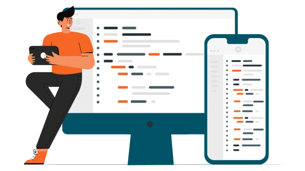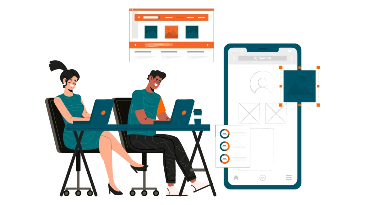


In the world of digital product design, UI vs UX is one of the most searched and misunderstood topics. Many people use “UI” and “UX” interchangeably, but they represent two distinct yet deeply interconnected disciplines.
Mastering the difference between UI and UX is essential for designers, web developers, product managers, and business owners who want to create successful websites, mobile apps, and digital experiences that users actually love.
This comprehensive guide explains UI vs UX clearly, with real-world examples, a detailed comparison table, benefits, best practices, and 2026 trends to help you build better products.
Main Highlights
- UI vs UX are not the same: UI, or User Interface, focuses on visual and interactive elements such as colors, typography, buttons, and layouts. UX, or User Experience, covers the whole user journey including research, wireframing, user flows, and overall usability. Understanding this difference helps build digital products that work well.
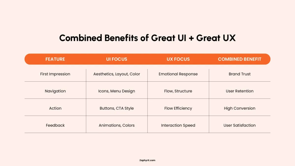
- Great products need both UI and UX to work together. A good looking interface with a confusing experience frustrates users. A functional experience with poor visuals reduces trust and engagement. The best digital products, like Spotify, combine both to give users a smooth and reliable experience.
- Start with UX before polishing the UI. A smart design process begins with user research, structure, and wireframes, then moves to visual design and microinteractions. This approach saves time and money, reduces rework, and leads to better results.
What is UI Design?
UI design (User Interface design) is the process of creating the look, layout, and clickable parts of a website, app, or software development. It decides where buttons go, what colors to use, how text looks, and what happens when you tap or click something. Good UI design reduces user mistakes, builds brand trust, and makes digital experiences feel smooth and intuitive. Common tools for UI design include Figma, Sketch, and Adobe XD.
Key Elements of UI Design:
- Color palettes and visual hierarchy
- Typography and iconography
- Buttons, forms, sliders, and navigation components
- Micro-interactions and smooth animations
- Responsive layouts across devices
- Design systems and style guides
Goal of UI Design: Create an aesthetically pleasing, polished, and intuitive interface that builds instant trust and delight.
What is UX Design?
UX design means designing the entire journey a person takes when using a product. It focuses on making that journey feel smooth, logical, and satisfying. A UX designer researches user needs, creates flowcharts (user flows), builds wireframes, and tests prototypes to remove confusion or frustration. The goal of good UX design is to make products intuitive, efficient, and even delightful. Poor UX causes confusion, high bounce rates, and lost customers. Common tools for UX design include Figma, Miro, Sketch, and UserTesting.
Key Elements of UX Design:
- User research and persona development
- Information architecture and user flows
- Wireframing and low-fidelity prototyping
- Usability testing and A/B testing
- Accessibility and inclusive design
- Customer journey mapping
Goal of UX Design: Deliver useful, usable, efficient, and satisfying experiences that keep users coming back.
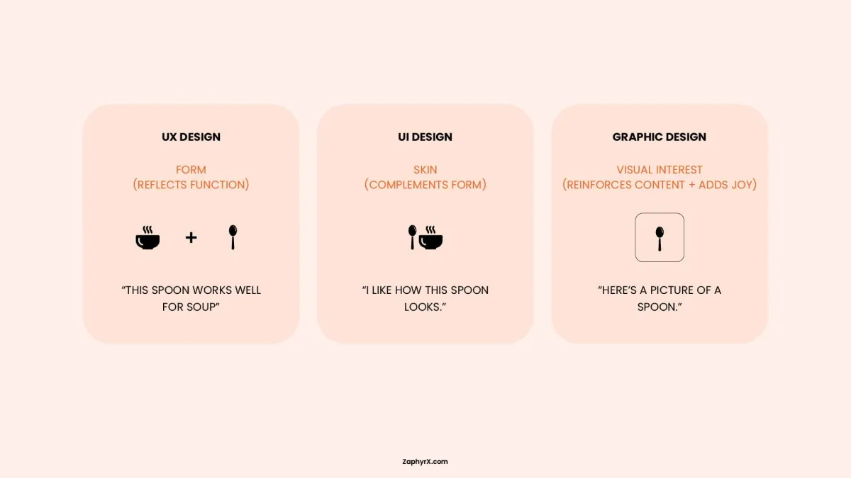
Key Differences Between UX and UI
UX/UI web design and development services share common ground. Both disciplines require understanding user needs and working alongside app developers, product managers, and researchers. Designers in both roles often use the same software, such as Figma or Miro. But their responsibilities, timing, and success criteria differ in meaningful ways.
| Aspect | UI Design | UX Design |
|---|---|---|
|
Primary Focus |
Visual presentation, polish, and direct interaction |
Complete journey, problem solving, and ease of use |
|
Scope |
Individual screens, components, and micro-interactions |
Entire flow from first contact to long‑term usage |
|
Key Skills |
Color theory, typography, layout, motion design, design systems |
User research, journey mapping, wireframing, prototyping, usability testing |
|
Stage in Process |
Later stage, applied after structure is defined |
Early stage, starting with discovery and strategy |
|
Typical Deliverables |
High‑fidelity mockups, style guides, icon sets, animation specs |
User personas, flow diagrams, wireframes, test reports |
|
Measurement |
Visual consistency, component reuse, brand adherence, click‑through on visuals |
Task completion rate, error rate, time on task, retention, satisfaction score |
|
Analogy |
Interior paint, lighting, and furniture finish |
Floor plan, room layout, and daily living experience |
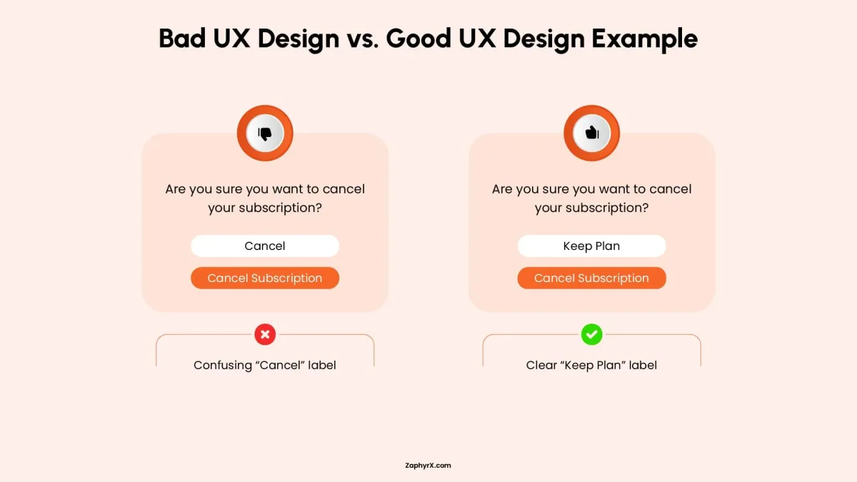
UI vs UX: Good and Bad Design Examples
Seeing how UI and UX work together (or fail to) makes the difference concrete. Below are four common combinations, ranging from ideal to deeply flawed.
1. Good UI + Good UX
Example: Spotify
Spotify succeeds because both disciplines receive equal care. The user interface delivers polished album artwork, fluid animations, and a consistent dark theme that reduces eye strain. The user experience ensures smart playlists that adapt to listening habits, seamless syncing across devices, and effortless music discovery through personalized recommendations. Together, they create a product that feels both beautiful and effortless to use.
2. Beautiful UI but Poor UX
Example: News websites with video autoplay and paywall pop‑ups
Many premium news sites use high‑quality photography, elegant typography, and clean layouts. However, autoplay videos follow you down the page, paywall modals appear every few clicks, and related articles are buried inside confusing menus. The interface looks trustworthy and polished, but the experience pushes readers away before they finish an article. Visuals invite people in; poor navigation and interruptions drive them out.
3. Strong UX but Average UI
Example: Wikipedia
Wikipedia has never been known for visual flair. The layout is mostly text, links are standard blue, and images appear in simple boxes. Yet the user experience is outstanding. Search is fast and accurate. Pages load quickly. Topics are cross‑linked logically. You can go from a random article to a well‑researched answer in seconds. The unpolished interface does not get in the way of the product’s core value: delivering reliable information efficiently.
4. Poor UI + Poor UX
Example: Old airline check‑in kiosks (circa 2010)
Some early self‑service kiosks had tiny low‑contrast screens, unresponsive buttons, and inconsistent on‑screen language. The user interface was visually cluttered and hard to read. The user experience was equally bad: finding a booking required multiple confusing steps, error messages were cryptic, and there was no clear way to go back. Passengers often gave up and waited in line. The combination of poor visuals and a broken journey made a simple task frustrating for everyone.
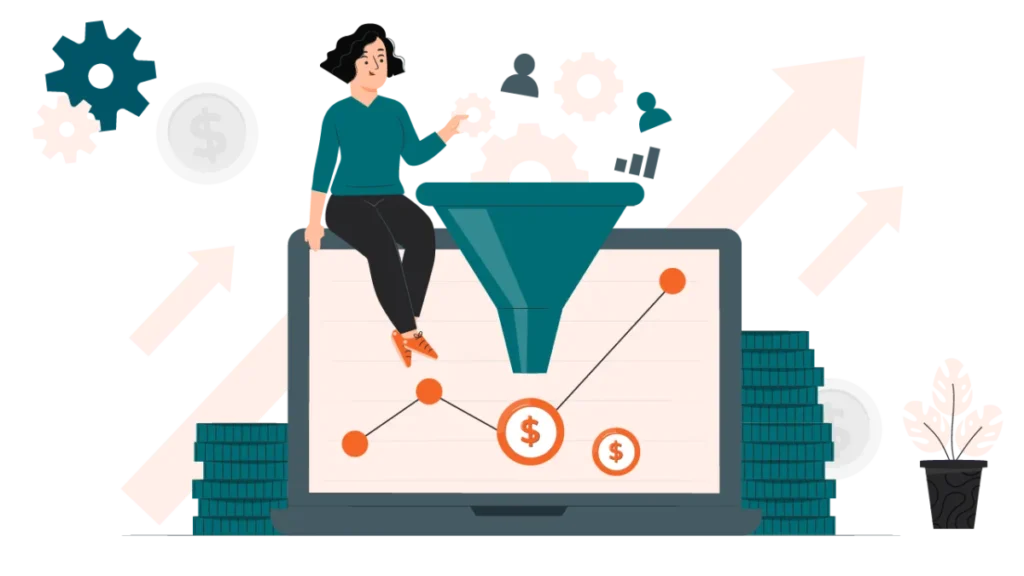
Benefits of UI and UX Design for Businesses
Investing in both UI and UX delivers measurable returns across different parts of a business. Below are the specific benefits broken down by discipline, followed by the advantages of having both.
Benefits of Good UX Design
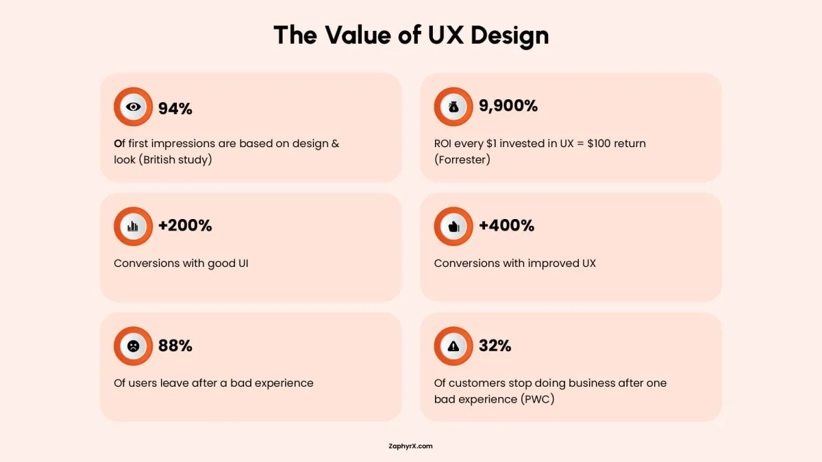
- Higher task completion rates: When users can finish what they came to do, fewer people abandon the process. That means more signups, more purchases, and more successful form submissions.
- Lower support costs: Clear navigation and intuitive flows reduce the number of users who get stuck and need help. Fewer support tickets, emails, and phone calls lower operational expenses.
- Better user retention: A product that solves a problem without frustration keeps people coming back. Higher retention means lower customer acquisition costs over time.
- Faster onboarding: New users learn the product quickly when the journey is logical. Faster time‑to‑value reduces early drop‑off and improves trial‑to‑paid conversion rates.
- Reduced development rework: Catching structural problems in wireframes instead of during coding saves weeks of developer time. Changes made late cost significantly more.
Benefits of Good UI Design
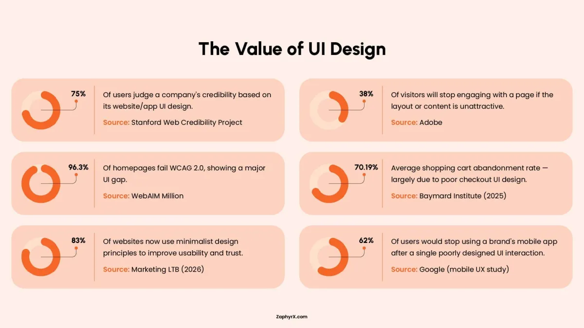
- Stronger first impressions: Users judge a product’s credibility within seconds of seeing it. A polished, professional interface builds trust immediately, which matters most for new visitors.
- Higher click‑through and engagement: Clear visual hierarchy and obvious clickable elements guide users to important actions. Well‑designed buttons, forms, and menus increase interaction rates.
- Consistent brand perception: Uniform colors, typography, and spacing across every screen make a business look reliable. Inconsistent design signals carelessness and erodes confidence.
- Fewer visual errors: Good UI uses contrast, spacing, and familiar patterns to prevent mistakes. For example, a disabled button looks different from an active one. Clear error messages use color and placement to get noticed.
- Easier scaling with design systems: A well‑built UI includes a design system of reusable components. Adding new features becomes faster and cheaper because designers and developers reuse existing patterns.
A Simple Business Rule
If your business has a conversion problem, look at UX first. If you have a trust or credibility problem, look at UI first. If you have both, fix UX before polishing the UI. A beautiful broken product still fails. A functional but ugly product can survive. A functional and beautiful product leads the market.
So, Which Is More Important in 2026: UI or UX?
The short answer is neither. Asking which matters more is like asking whether a car needs an engine or wheels. That said, the weight of each shift depends on context.
When UX matters more
If users cannot complete basic tasks, no amount of visual polish will save the product. For functional tools like accounting software, medical portals, or delivery apps, poor UX leads to immediate abandonment. In 2026, users have zero tolerance for confusing flows. If your retention is low or support tickets are high, UX is the bottleneck.
When UI matters more
For products where trust and first impressions drive adoption, UI often carries the first few seconds. Take an example of e‑commerce stores, portfolio sites, or consumer apps competing for downloads. In a crowded market, a polished, confident interface signals reliability. If your bounce rate is high within the first ten seconds but engagement after that is fine, UI is likely the issue.
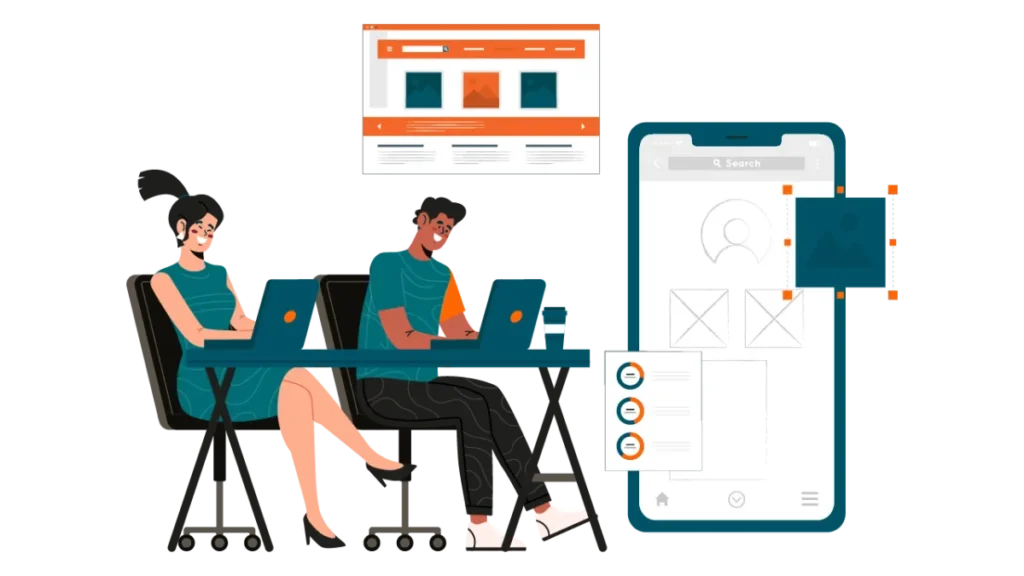
How Do UI and UX Work Together in Design?
UI and UX work together in a clear sequence. Below is the typical process a product team follows to move from an app idea to a finished design, showing exactly how UX and UI hand off work to each other:
Step 1: User research and problem definition (UX alone)
- User personas (fictional profiles of typical users)
- A clear problem statement (e.g., “Small business owners need a faster way to create invoices”)
- Research notes from interviews and surveys
- Competitor analysis summary (strengths and weaknesses of similar products)
- Key insights and user pain points documented
Step 2: Information architecture and user flows (UX alone)
Using the research, the UX designer structures how information is organized. This is called information architecture. They create a site map showing every page or screen and how they connect. Then they map user flows: step‑by‑step paths a user takes to complete a goal, such as signing up, searching for an item, or checking out. If the structure is confusing, users will get lost even if each screen looks great. Flows reveal unnecessary steps before any design work begins.
Output
- Site map (hierarchical diagram of all content)
- User flow diagrams (e.g., “Home → Search → Product page → Add to cart → Checkout → Confirmation”)
- A list of key tasks users need to complete
- Identification of decision points and branches in each flow
- Edge case scenarios mapped (e.g., empty state, error state)
Step 3: Low‑fidelity wireframing (UX alone)
The UX designer sketches rough layouts of each screen using simple boxes, lines, and placeholder text. These wireframes have no color, no images, and no real typography. They are often drawn on paper or in grayscale using tools like Figma or Balsamiq. The team tests these wireframes with real users by asking them to complete tasks while thinking aloud.
Wireframes are cheap to change. Testing at this stage catches major navigation or structure problems before any visual polish is added. It saves weeks of rework later.
Output
- Low‑fidelity wireframes (grayscale, boxy layouts)
- Usability test notes from user sessions
- Revised wireframes based on initial feedback
- Annotated notes on navigation and layout decisions
- A list of open questions or assumptions for further testing
Step 4: UX to UI handoff (Collaboration)
Once wireframes test well, the UX designer prepares a handoff package for the UI designer. This includes annotated wireframes (with notes explaining what each element does), user flow diagrams, and success metrics for key tasks. The UX and UI designers meet to review the package. The UI designer asks clarifying questions such as: “Which button is the primary action on this screen?” or “What happens when a user makes an error here?”
A poor handoff leads to a UI that looks good but breaks the intended flow. This step ensures the UI designer understands the logic before adding visuals.
Output
- Handoff document (wireframes with detailed annotations)
- A shared glossary of interactive states and behaviors
- Success metrics for key tasks (e.g., “checkout completion under 60 seconds”)
- A recorded meeting summary with resolved questions
- A clear designation of primary vs. secondary actions per screen
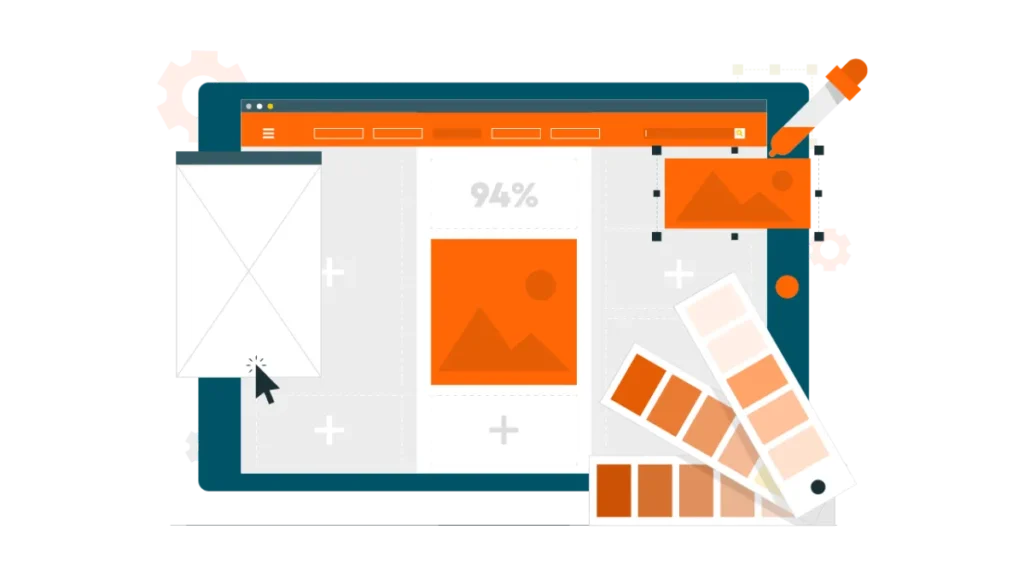
Step 5: High‑fidelity UI design (UI leads)
The UI designer takes the approved wireframes and applies the final visual layer. This includes selecting a color palette, choosing typography, creating or sourcing icons, defining button states (normal, hover, pressed, disabled), adding subtle animations (micro‑interactions), and ensuring the layout adapts to different screen sizes. The output is a high‑fidelity mockup and a clickable prototype that looks and feels like the final product.
This is where the product gains personality, trust, and polish. Good UI makes interfaces feel responsive, clear, and professional. It also reduces user errors by using visual cues (e.g., making clickable elements look clickable).
Output
- High‑fidelity mockups (full color, real text, final assets)
- A clickable prototype (e.g., in Figma or Adobe XD)
- A design system or style guide (colors, typography, spacing, icon set)
- Button state definitions (normal, hover, active, disabled, focused)
- Micro‑interaction specifications (e.g., transition timing, animation curves)
Step 6: Collaborative usability testing (UI + UX together)
The high‑fidelity prototype is tested with real users again. Both UX and UI designers observe the sessions. The UX designer watches for task completion, time on task, errors, and signs of confusion. The UI designer watches for visual misinterpretation: for example, a user not recognizing a button as clickable, missing an important message because the text contrast is too low, or finding an animation distracting instead of helpful.
Testing at the high‑fidelity stage catches problems that only appear when visuals are added. A wireframe might test fine, but real colors and spacing can change how users perceive the interface.
Output
- Two sets of findings: UX issues (flow, logic) and UI issues (visual clarity, polish)
- Recordings or notes from each test session
- Task completion rates for each key flow
- A list of specific UI elements that caused hesitation or error
- A severity rating for each issue (critical, major, minor)
Step 7: Iteration loop (UI + UX together)
The team triages every issue found in testing. Problems are labeled as UX or UI.
- If a user fails to complete a task (UX issue), the UX designer revisits the wireframe or user flow. Changes may be structural, such as adding a back button or rearranging steps.
- If a user hesitates because a button blends into the background (UI issue), the UI designer adjusts color, contrast, size, or spacing.
After changes are made, the team tests again. This loop repeats until both UX metrics (e.g., 90% task completion) and UI metrics (e.g., no visual confusion) are met.
Iteration is where real improvement happens. No design is perfect on the first try. Working together in short cycles prevents either discipline from blaming the other and ensures the final product works visually and functionally.
Output
- Updated wireframes (if UX changes were made)
- Updated mockups or prototype (if UI changes were made)
- A change log tracking each iteration
- Retest results showing improvement or remaining issues
- A final approval sign‑off from both UX and UI leads
Step 8: Developer handoff (UI leads, UX supports)
The UI designer prepares final assets for developers: exported icons and images, a style guide with color codes and font sizes, interaction specifications (e.g., “this button slides up 4px on hover”), and a link to the clickable prototype.
The UX designer provides additional context: user stories (e.g., “as a first‑time user, I want to see a welcome message”), edge cases (e.g., “what happens when a search returns no results”), and acceptance criteria for testing. Both designers attend a handoff meeting to answer developer questions.
Developers are not designers. Without clear specs, they will guess, and the final product will drift from the intended design. A thorough handoff reduces rework and miscommunication.
Output
- Developer‑ready assets (exported icons, images, font files)
- Style guide (color hex codes, font sizes, spacing units, border radii)
- Interaction spec document (transitions, hover states, error messages)
- User stories and edge case notes (from UX)
- A recorded handoff meeting with Q&A and decisions
Step 9: Launch and post‑launch measurement (UX leads)
After the product launches, the UX designer tracks quantitative metrics using analytics tools. Key metrics include task completion rate (did users finish what they came for?), error rate (how often did they click something wrong?), time on task (how long did key actions take?), and retention (do users come back?).
The UI designer monitors visual consistency across live pages and collects qualitative feedback through surveys or user interviews, asking questions like “Does the product look trustworthy?” or “Is anything hard to read or click?”
A launch is not the finish line. Real usage uncovers issues that testing never found. Measuring success separately for UX and UI tells you exactly where to invest in the next version.
Output
- Analytics dashboard with UX metrics (completion rate, error rate, time on task, retention)
- User feedback report on visual polish and trust (from surveys and interviews)
- A list of UI inconsistencies found in the live product
- A prioritized list of improvements for the next design cycle
- A post‑launch review document shared with the team
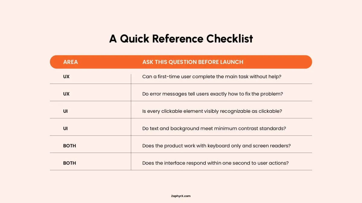
Best Practices for Effective UI and UX Design
Following established best practices reduces guesswork and prevents common mistakes. Below are guidelines separated by discipline, plus practices that apply to both.
How To Achieve UX Maturity Level
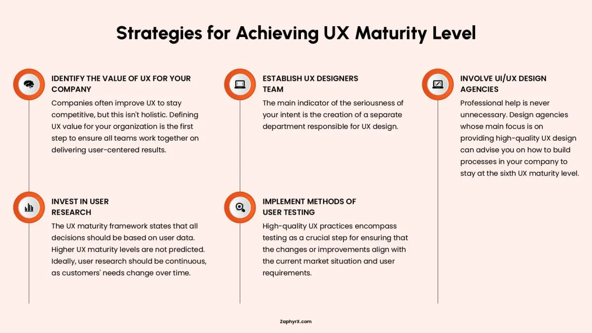
1. Identify the Value of UX for Your Company
Many companies improve user experience just to keep up with competitors. That approach is too narrow. You need to define what good UX actually means for your specific business. Does it mean fewer customer support calls? Higher sales? Faster task completion? Longer time spent in your app? Once you define that value clearly, every team from product to engineering to marketing can work toward the same goal. Without that shared definition, people pull in different directions.
2. Establish a UX Designers Team
You cannot take UX seriously without dedicated people whose main job is to design for users. A separate team or department shows real commitment. That team owns the user experience. They conduct research, create wireframes, test prototypes, and advocate for the customer during product discussions. If UX is just something developers do on the side, it will never be more than an afterthought. A dedicated team signals that user experience matters as much as features or deadlines.
3. Involve UI/UX Design Agencies
Outside help is useful even when you have an internal team. A specialized design agency works on UX every single day across many different industries. They have seen what works and what fails. They can audit your current processes, point out blind spots, and recommend changes that move you to a higher level of UX maturity. You do not need to keep an agency on retainer forever. But bringing one in for a few months can reset your direction and train your people.
4. Invest in User Research
The UX maturity model is clear: every important decision should be based on real data from real users, not on guesses or opinions. That means talking to customers, watching them use your product, and analyzing how they behave. And you cannot do this once and stop. Customers need change over time. New features change how people work. Your competitors raise expectations. Continuous research keeps you from building things nobody wants or fixing problems nobody has.
5. Implement Methods of User Testing
Research tells you what users need. Testing tells you whether your solution actually works. Testing means giving a working prototype or a live feature to real users and watching what they do. Where do they get stuck? What confuses them? What do they ignore? Testing should happen before you launch big changes, not after. It is much cheaper to fix a problem in a prototype than to rebuild something after it is already live. Good teams test early and often, not just at the end.
Building UCD (User Centric Direction)
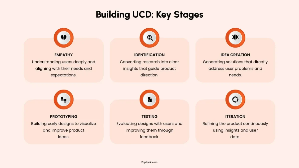
1. Empathy
You cannot design for someone you do not understand. Empathy means learning what users actually feel, need, and struggle with. This is not about feeling sorry for them. It is about setting aside your own preferences and seeing the product from their point of view. You do this through interviews, observations, and simply listening without jumping to solutions.
2. Identification
Research gives you raw information. Identification turns that information into clear, useful insights. You look for patterns. What problems come up again and again? What do users say they need versus what they actually do? You turn messy notes into a short list of real user needs that will guide every decision after this point. Without identification, you have data but no direction.
3. Idea Creation
Now you come up with solutions. But you do not start with one perfect idea. You generate many possibilities, even rough or strange ones. The goal is quantity first, then quality. You gather your team, sketch things out, write down wild ideas, and push past the obvious answers. The best solution is rarely the first one anyone thinks of. Give yourself room to explore.
4. Prototyping
An idea on paper is hard to evaluate. A prototype makes it real enough to test. A prototype does not need to be polished or complete. It can be a paper sketch, a clickable wireframe, or a rough digital mockup. The point is to create something users can interact with so you can see what works and what does not before you spend time and money building the real thing.
5. Testing
You give your prototype to real users and watch what they do. You do not explain or defend your design. You just watch. Where do they hesitate? What do they click on? What confuses them? Testing almost always reveals problems you did not see yourself. That is normal and useful. You take that feedback, note what needs to change, and go back to improve the design.
6. Iteration
You do not go through these stages once and then stop. Iteration means you repeat the cycle. You test, learn, change, and test again. Each round makes the product better. User needs change over time, so even a finished product should be revisited. Iteration turns design from a one time event into an ongoing process of steady improvement.
Practices for Both UI and UX
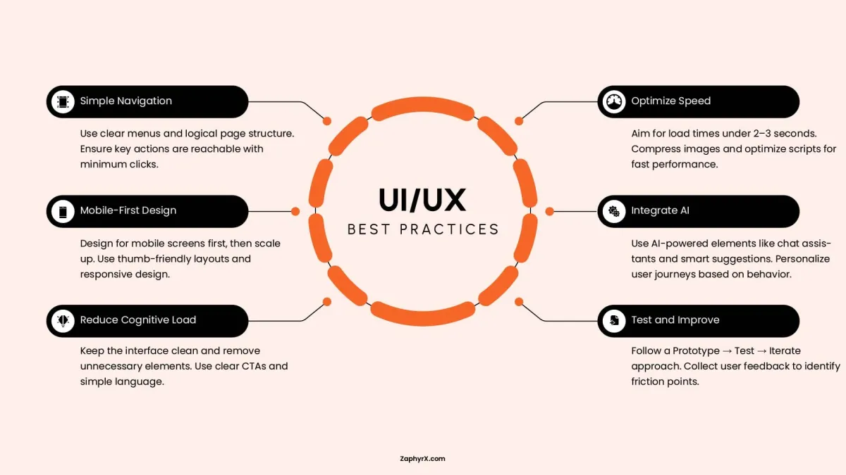
1. Simple Navigation
Users should never have to guess where to find something. Use clear menu labels that match common language, not internal terms. Organize your pages in a logical way so related items live near each other. Any important action, like buying a product or contacting support, should be reachable within two or three clicks. If a user has to hunt or click through five screens, you have lost them.
2. Mobile First Design
Start by designing for the smallest screen, a phone. Then add more space and features for tablets and computers. This forces you to focus on what truly matters. On mobile, people use their thumbs to tap. Place key buttons and controls where thumbs naturally reach, near the bottom and center of the screen. Your design should stretch and shrink smoothly across any device without breaking or hiding important content.
3. Reduce Cognitive Load
Cognitive load is just a fancy term for how hard someone has to think to use your interface. Every extra button, word, or option makes them think harder. Keep your screens clean. Remove anything that is not necessary for the task at hand. Use plain, short language for buttons and instructions. A user should know exactly what will happen when they click something. Do not make them guess or decode your meaning.
4. Optimize Speed
People will leave if your page takes more than two or three seconds to load. That is not an opinion. It is a fact. Speed is part of the user experience. Compress your images so they look fine but load fast. Clean up your code and remove unnecessary scripts. Test your site on slow connections, not just fast office wifi. A beautiful design means nothing if nobody waits around to see it.
5. Integrate AI Thoughtfully
AI can make an interface smarter, but only if used carefully. A chat assistant can answer simple questions when your team is asleep. Smart suggestions can show a returning customer what they usually buy. Personalization can change the layout based on behavior. But AI should help, not annoy. Do not add a chatbot that gets in the way or makes suggestions that are clearly wrong. Test any AI feature with real users before you rely on it.
6. Test and Improve
You will never get the design right on the first try. That is fine. The key is to build a rough version, test it with real users, watch what goes wrong, and then fix it. Then test again. Collect feedback through short surveys, session recordings, or simply asking users what confused them. Each round of testing and fixing makes the product better. The teams that skip testing are the ones that launch broken interfaces and wonder why nobody stays.
What’s the Average Cost of UI/ UX Design?
The cost of UI and UX design in 2026 depends on several factors: the size and complexity of the product, the experience level of the designers, your geographic location, and whether you hire freelancers, an agency, or an in‑house team. A simple landing page costs far less than a full enterprise platform.
Below are estimated ranges for common project types. These figures assume standard market rates for professional UI/UX designers in North America and Western Europe. Prices may be lower elsewhere or higher for premium agencies.
| Project Type | Estimated Cost Range | What’s Typically Included |
|---|---|---|
|
Simple Landing Page / Website Redesign |
1,500–8,000 |
Basic UI design, responsive layout, limited prototype |
|
Small Business Website (8–15 pages) |
5,000–15,000 |
User flows, UI design, basic user research |
|
Mobile App MVP |
8,000–25,000 |
Research, wireframes, 15–30 screens, clickable prototype |
|
Mid‑sized SaaS Dashboard |
15,000–40,000 |
In‑depth UX research, design system, multiple user roles |
|
Complex Enterprise Platform |
40,000–150,000+ |
Full research cycle, usability testing, accessibility compliance, multiple iterations |
Quality UI/UX design is not an expense. It is an investment that directly affects your bottom line. Companies that invest in good design during the early stages typically see a return of 200–400% through higher conversion rates, lower bounce rates, and fewer support requests.
More importantly, fixing a UX problem after development or launch costs 10 to 100 times more than solving it during the wireframing phase. A missing back button caught in low‑fidelity testing costs minutes to correct. The same issue discovered in a live application may require developer time, code changes, app store updates, and customer communication.
Top UI/UX Trends to Follow in 2026
Design trends shift as technology and user habits evolve. In 2026, the focus has moved from pure decoration to adaptability, website speed, and personalization. Below are the most relevant trends for UI and UX this year.
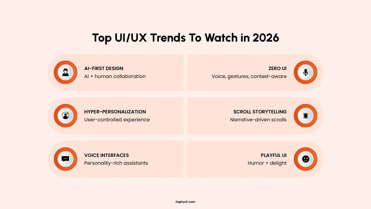
UX Trends for 2026
- AI‑powered adaptive interfaces: Instead of one static layout, products now adjust in real time based on user behavior. A frequent visitor sees shortcuts. A first‑time user sees guided steps. The interface learns without asking.
- Cross‑device continuity: Users switch between phone, laptop, tablet, and even watch. Good UX in 2026 saves progress and context across devices. You start a task on mobile and finish on desktop without repeating steps.
- Voice and text hybrid flows: More products combine typing with voice commands. Users can speak a search query and then tap to refine results. UX designers now plan for both input methods in the same flow.
- Proactive assistance, not just reactive: Instead of waiting for users to get stuck, products anticipate needs. A travel app offers to check in when it detects you are near the airport. A project management tool suggests next tasks based on past behavior.
- Privacy‑first experiences: Users are more aware of data collection. UX now includes clear consent screens, easy data deletion, and transparent explanations of what information is used and why. Hiding privacy settings hurts trust.
UI Trends for 2026
- Depth and spatial layering: Flat design has evolved. UI now uses subtle shadows, overlapping elements, and motion to create depth. This helps users understand hierarchy without heavy borders or colors.
- Glassmorphism and blur effects: Frosted glass backgrounds with backdrop blur remain popular. They separate foreground content from background while keeping a light, modern feel. Used sparingly, they add polish without slowing performance.
- Expressive micro‑interactions: Buttons that bounce slightly on click, checkmarks that draw themselves, and loaders with personality. These small animations make products feel responsive and human.
- Bold, variable typography: Designers use large, expressive typefaces as the main visual element. Variable fonts allow a single font file to adjust weight, width, and slant dynamically. This reduces load times while enabling creative layouts.
- Dark mode as default, not an afterthought: More apps launch with dark mode fully designed from the start. In 2026, it is no longer a secondary theme. UI designers plan color contrast, shadows, and elevation for both light and dark schemes simultaneously.
Create Aesthetically Pleasing UI/UX Designs with ZAPHYRX
You now know the difference between UI and UX. You understand why both matter and how they work together. The next step is putting that knowledge to use.
ZAPHYRX helps businesses build products that look good and work well. We take care of user research, wireframes, testing, visual design, and the final delivery to your development team. The result is a product that feels intuitive and meets user needs.
If you want to improve your product, contact us to book a free consultation. We will review your current design, understand your goals and users, and explain what steps are needed to move forward.
Frequently Asked Questions
It depends on your project. For very small projects, a skilled generalist can handle both. However, for MVP launches or scaling platforms, dedicated roles are invaluable. A UX designer validates the logic (user flows, research) while a UI designer perfects the surface (visual layout, micro‑interactions). Hiring specialized talent typically leads to a more polished and robust final product.
This usually points to a UX issue, but not the kind you might think. It is likely a problem with product‑market fit, which stems from initial UX research. If you built a functional product that nobody wants, it means you probably did not do enough discovery to validate the problem before building the solution. The UX discovery phase prevents this scenario.
Poor UI damages trust, lowers perceived value, and makes it harder for users to take action. However, users will often tolerate average UI if the UX is exceptional and solves a critical problem (like early Craigslist). You risk higher bounce rates in the first few seconds, but you may still retain power users who need your solution desperately.
Poor UX is fatal for most consumer products. Users will abandon a beautiful but confusing interface immediately. It leads to low retention, high support costs, and negative reviews. Unlike poor UI, poor UX cannot be hidden by visual polish. You can progressively enhance UI, but fixing broken flows post‑launch is expensive and frustrating for existing users.
As early as the ideation phase. Bring a UX designer in before writing a single line of code or finalizing feature lists. They will help you validate assumptions, map user flows, and create testable prototypes. This approach saves months of development time and prevents building features nobody actually needs.
You can, but be prepared for mixed results. Developers are trained to think in logic and systems. While some have an eye for design, their primary skill set rarely includes user psychology, color theory, or information architecture. Expect to pay for rework or accept a “developer‑designed” look that works but feels clunky to end users.
Look for a portfolio that shows process, not just final results. A strong candidate presents case studies explaining their research, testing, iteration, and measurable outcomes (e.g., increased conversion, reduced drop‑off). Ask them how they handle stakeholder feedback and tight deadlines. Great designers defend user needs without being adversarial.
Treating UI/UX as an afterthought or a “polish phase” at the end of development. This forces teams to make cosmetic changes within rigid technical constraints. The best products design iteratively: research → prototype → test → build → iterate. Skipping the front‑loaded research and testing almost always results in a product that misses the mark.